GSE5281 · n=105 R Python JS

Alzheimer's Disease Transcriptomics
Cross-Tool Visualization

Differential expression analysis of GSE5281 — comparing visualization efficiency across R (limma · ggplot2), Python (Seaborn · Matplotlib) and JavaScript (Plotly.js) for bioinformatics workflows.

limma · DESeq2 GO ORA · GSEA 5 Brain Regions Microarray
21,358
Genes Tested
Affymetrix HG-U133 Plus 2.0
3,358
DEGs · Entorhinal Cortex
adj.P < 0.05 · |logFC| > 1
841
DEGs · Superior Frontal Gyrus
adj.P < 0.05 · |logFC| > 1
27
Enriched Pathways · EC
Hallmark GSEA · padj < 0.05
105
Clean Samples
44 AD · 61 normal · 5 regions
Interactive Analysis
Plotly.js — hover · zoom · filter · export
Region
logFC cutoff
NS Genes
Search Gene
hover for details · scroll to zoom · click legend to filter
Volcano Plot
Interactive DE results · hover for gene info · click to highlight
Plotly.js · scatter
DEG Summary
Up/Down counts per brain region
Plotly.js · bar
GSEA Pathway Bubble Chart
Hallmark gene sets · NES vs −log₁₀(padj) · bubble size = leading edge genes · click bubble for pathway details
Plotly.js · scatter
Same Data, Three Tools
The same biological question — answered in R, Python, and JavaScript
R plot
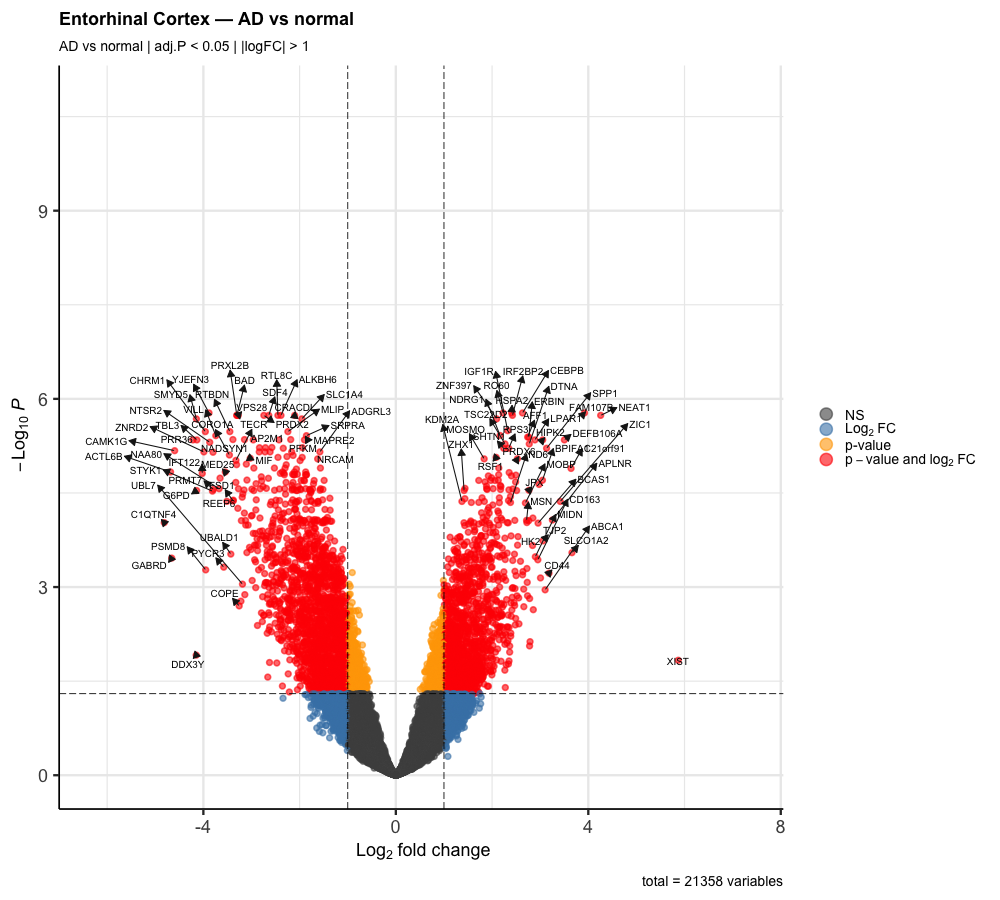
R — ggplot2 / EnhancedVolcano
Publication-quality static figures. R's bioinformatics ecosystem (limma, ggplot2, ComplexHeatmap) is the industry standard for omics analysis. Minimal code for maximum scientific output.
Lines of code~8
InteractivityNone
OutputPNG / PDF
Best forPublications
Python plot
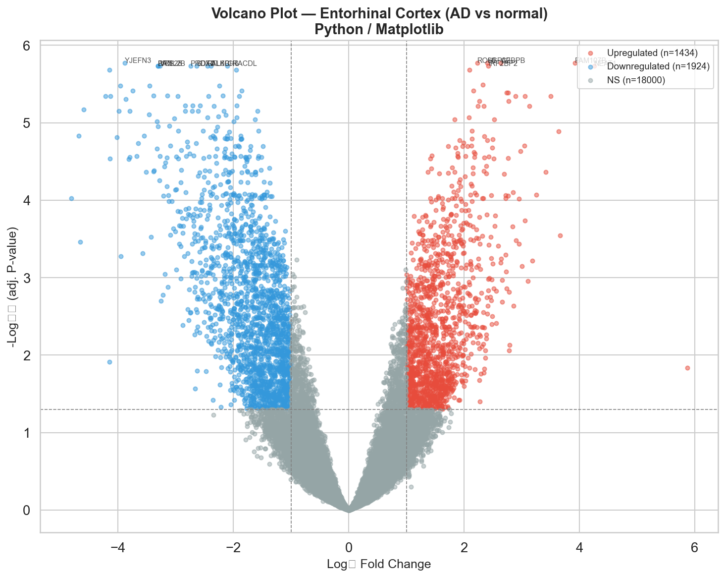
Python — Matplotlib / Seaborn
More verbose than R for the same output but integrates seamlessly with ML pipelines (scikit-learn, pandas). Ideal when your analysis and visualization live in the same notebook.
Lines of code~35
InteractivityNone
OutputPNG / SVG
Best forML Pipelines
JavaScript — Plotly.js
Full interactivity — hover, zoom, filter, export. The only tool that runs in a browser with no backend. Steeper learning curve but essential for sharing results with non-bioinformaticians and building web-based genomics tools.
Lines of code~80
InteractivityFull
OutputWeb / PNG
Best forSharing / Web
Feature R Python JavaScript
Setup complexityLowLowMedium
Bioinformatics packagesExcellentGoodNone
Statistical analysisExcellentGoodNone
InteractivityNoneLimitedFull
Web deploymentShiny onlyDash/StreamlitNative
ML integrationGoodExcellentNone
Publication figuresExcellentGoodLimited
Learning curveLowLowHigh
Methods & Pipeline
How this analysis was built
01
Data Acquisition
GSE5281 downloaded from NCBI GEO using GEOquery. 161 samples across 6 brain regions on Affymetrix HG-U133 Plus 2.0.
R · GEOquery
02
Preprocessing
RMA normalization, probe-to-gene mapping via hgu133plus2.db, duplicate probe collapsing. 54,675 probes → 21,358 genes.
R · affy · biomaRt
03
Differential Expression
Region-stratified limma analysis. Design matrix with AD vs normal contrast. eBayes shrinkage. BH correction at adj.P < 0.05.
R · limma
04
Enrichment Analysis
GO ORA on significant DEGs and GSEA on full ranked gene lists using Hallmark gene sets from MSigDB.
R · clusterProfiler · fgsea
05
Python Visualization
Same DE results reproduced in Python using Seaborn and Matplotlib. PCA with scikit-learn. Clustermap of top 50 DEGs.
Python · Seaborn · sklearn
06
Interactive Dashboard
Vanilla JS dashboard using Plotly.js. Loads CSV results via fetch(). Deployed to GitHub Pages with zero backend.
JavaScript · Plotly.js